Mac desktop differs from a PC
So, you been watching those Apple ads on TV for some time now, grumbling about how come that Mac kid keeps making fun of your friend, the PC, and keeps getting away with it.
For some, the answer is simple: switch to another channel. Others, though, find themselves intrigued enough to check a Mac out. At first glance, most people don’t see a huge difference between the two systems. Tower – check, monitor – check, keyboard and mouse – check and check again. Whoopie.
Then you boot it up. What was that noise? Where’s the ‘Start Menu’? Where’s ‘My Computer’? How can I find anything that’s not already on this goofy dock thingy? And where are all my icons?
What we’ll try to do here is draw some comparisons between the Windows ‘comfort zone’, and the new computer experience that
OS X offers.
PCs and Macs both have similar goals in mind. So, it’s really not too hard to figure out where the PC analogues are on a Mac running
OS X
.
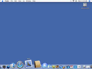
Let’s start with the most basic look around the OS X desktop. Here we’re using the latest version OS X Tiger, which is version 10.4.11. Unlike Windows machines, OS X desktops tend to be very free of icon clutter. The Hard Drive icon appears in the upper-right corner. An icon for the optical drive appears only if there’s actually anything in it; which makes sense, come to think of it. Otherwise, no other icons are present unless the user puts them there, and why would you do that?
Across the top you have what’s known as the Menu Bar. In most Windows applications, a bar like this appears at the top of the screen of a running program. But when you close the program, the menu bar goes away. In OS X it’s always there. That’s because Finder is always running. Finder is to OS X what Windows Explorer is in Windows.
When you open Explorer in Windows, you’ll also get a menu bar with similar options like Save, Open, Cut, Copy, Paste, as well as other items such as program preferences.
The same thing happens with Finder, but with a difference. What’s displayed on the Menu Bar depends on what program is in use at that moment. If you are running Windows XP, the Menu Bar will be configured for Windows XP
options and settings.
To get out of a certain program’s Finder options, just click anywhere on open desktop to take you to the basic Finder layout.
The Go option in the menu bar also allows you to access different groupings of programs like Computer, Network, Applications, and Utilities. Just click on ‘Go’ and a list of options will open up. The idea is that these items are locations on you computer or on a network that you would want to ‘Go’ to. Once you get used to it being there, you’ll get the hang of it in no time. Easy, huh?
On the far left is a little Blue Apple logo. This is just like the Start Menu in Windows. It gives you Shutdown and Reboot options. You can also update your software, just as you would using Microsoft Update. System Preferences are there as well so that you can tinker with your system’s innards to your hearts content. You can also check out your system’s configuration and adjust the Dock settings from here.
Ahh, yes – the Dock. Apple’s much ballyhooed mix of Bling and user-friendliness. It swells as you mouse over it for no other reason than that it looks cool. Oh, and it does, oh, yes, it does. Go to any Apple Store and watch as the customers zip back and forth over it for ages, bemused by its simple yet effective charm. And it’s more than just a silly diversion for an hour or two; you can place your favorite applications on it and have one click access them at any time.
Windows XP offered a similar option in its Start Menu, but you still had to click the Start Menu first to get to them. Windows’s Quick Launch was closer in concept, but nowhere near as cool. To place an application on the Dock, just drag its icon onto it, the other icons on the Dock will part to make room, then you just let go and it’s there. Don’t like a program that’s already on the Dock? Just drag it off the dock and let go and it will vanish in a puff of smoke. Neat! To launch an application just click on it once and the icon bounces as the program loads. Once loaded, a little inverted triangle appears below it, indicating it’s loaded and running. When the icon bounces hard and high, it wants your attention.
On the right side of the Dock, there is something similar to the Task Bar in Windows. Any programs you minimized appear as a miniature version of what’s on the screen. We’ll show you how to do that in the next step, but at least now you know your way around the Desktop.

